Painting …
interplay of light!
Adding different light sources
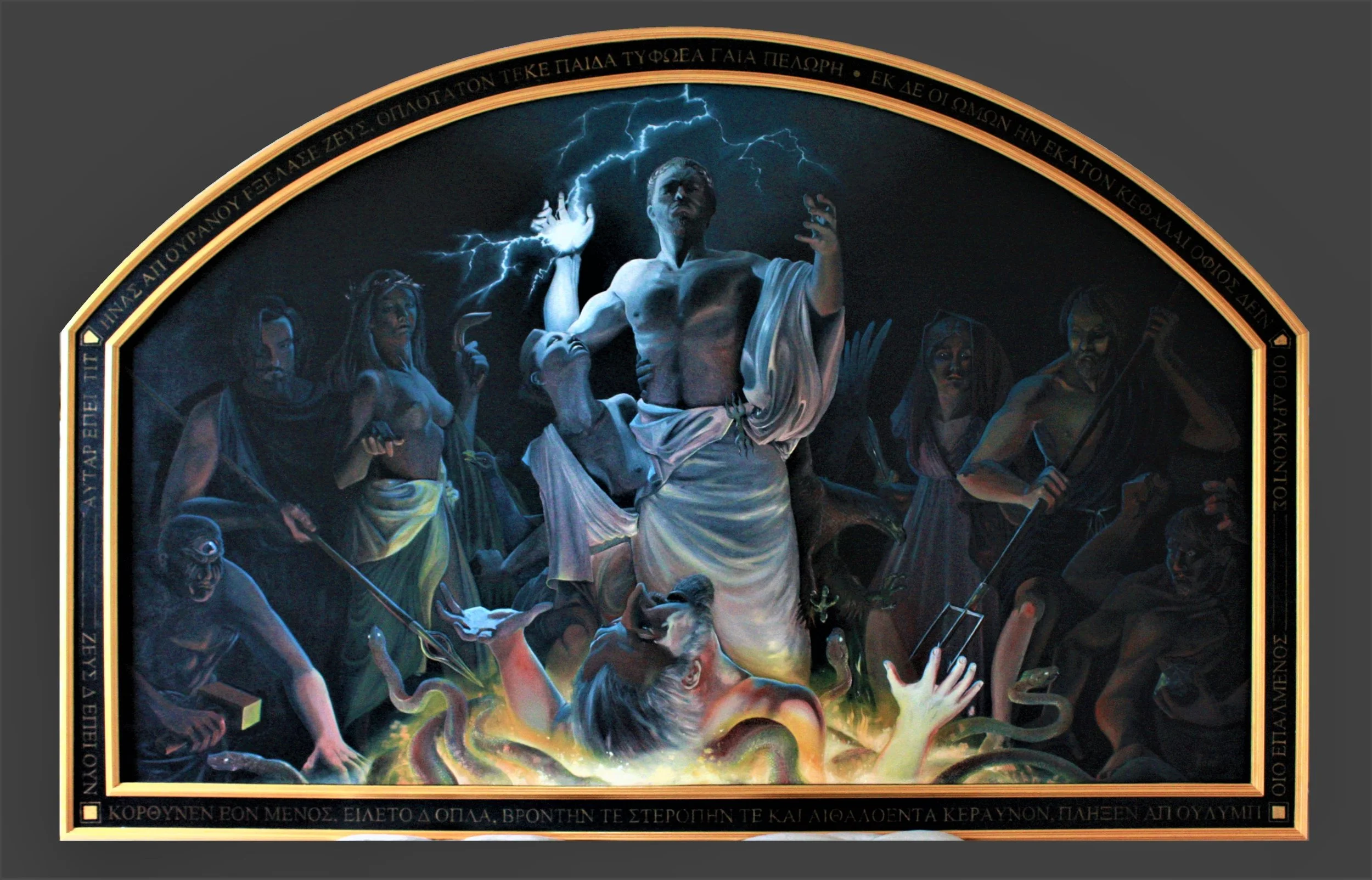
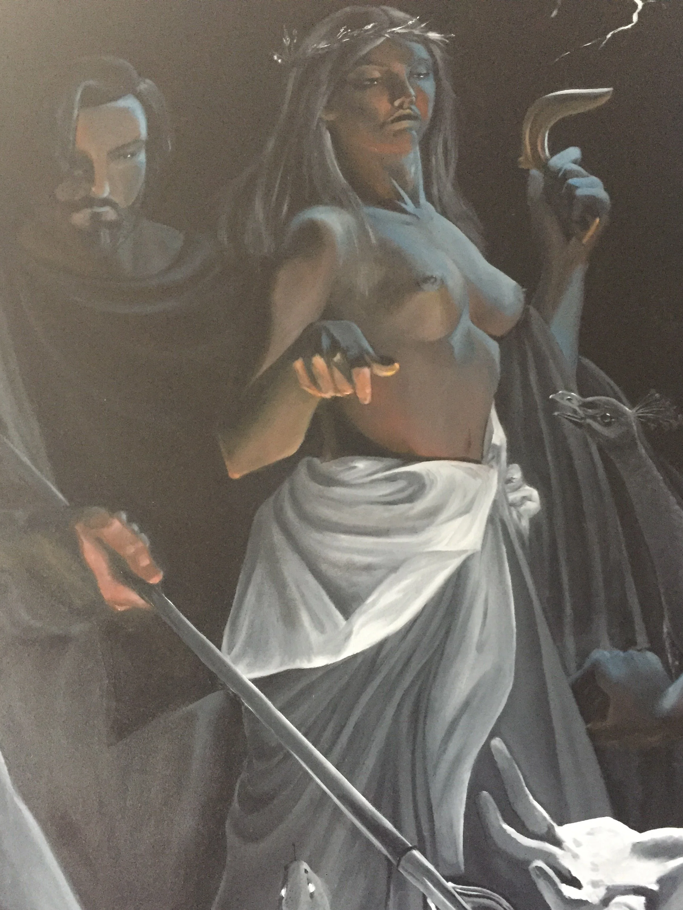
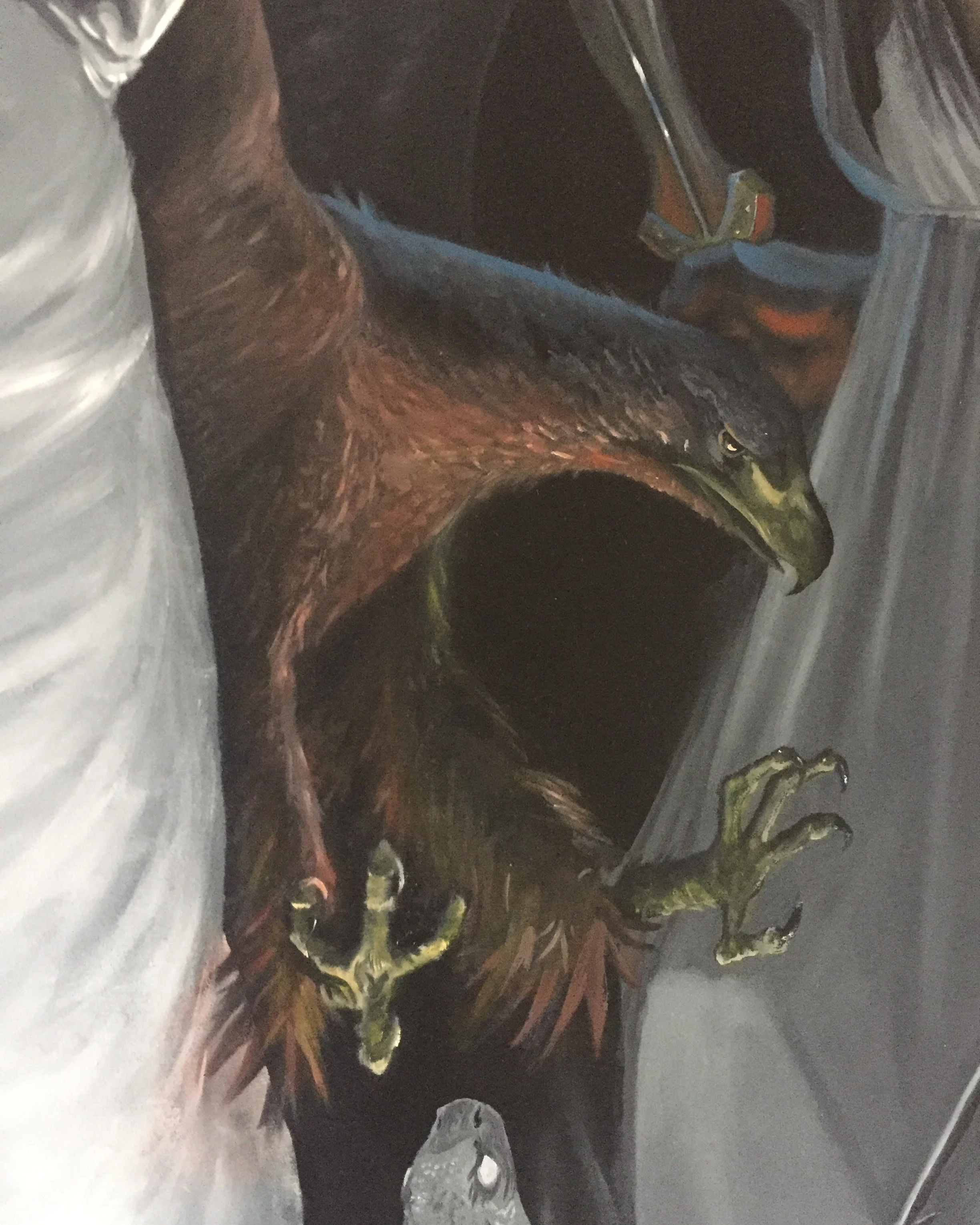
My painting style for this painting is clearly inspired by the works of Michelangelo Merisi as evidenced by the use of ‘clair obscur’ which is the basis of the compositional design. I, however, aim in this work, to not just continue the painting styles of the Old Masters in this painting, but to add to the and take things a step further. In this work the added step is seemingly simple yet elegantly complex in it’s execution (hopefully). Painters in the Caravagionesque style were masters in the study of light, but all major works I’m aware of use dramatic lighting using exclusively white light or yellow/reddish light from sources of fire. The step I’m trying to add in my design is to further investigate the use of monochromatic light sources (or at least light sources with a single dominant colour).
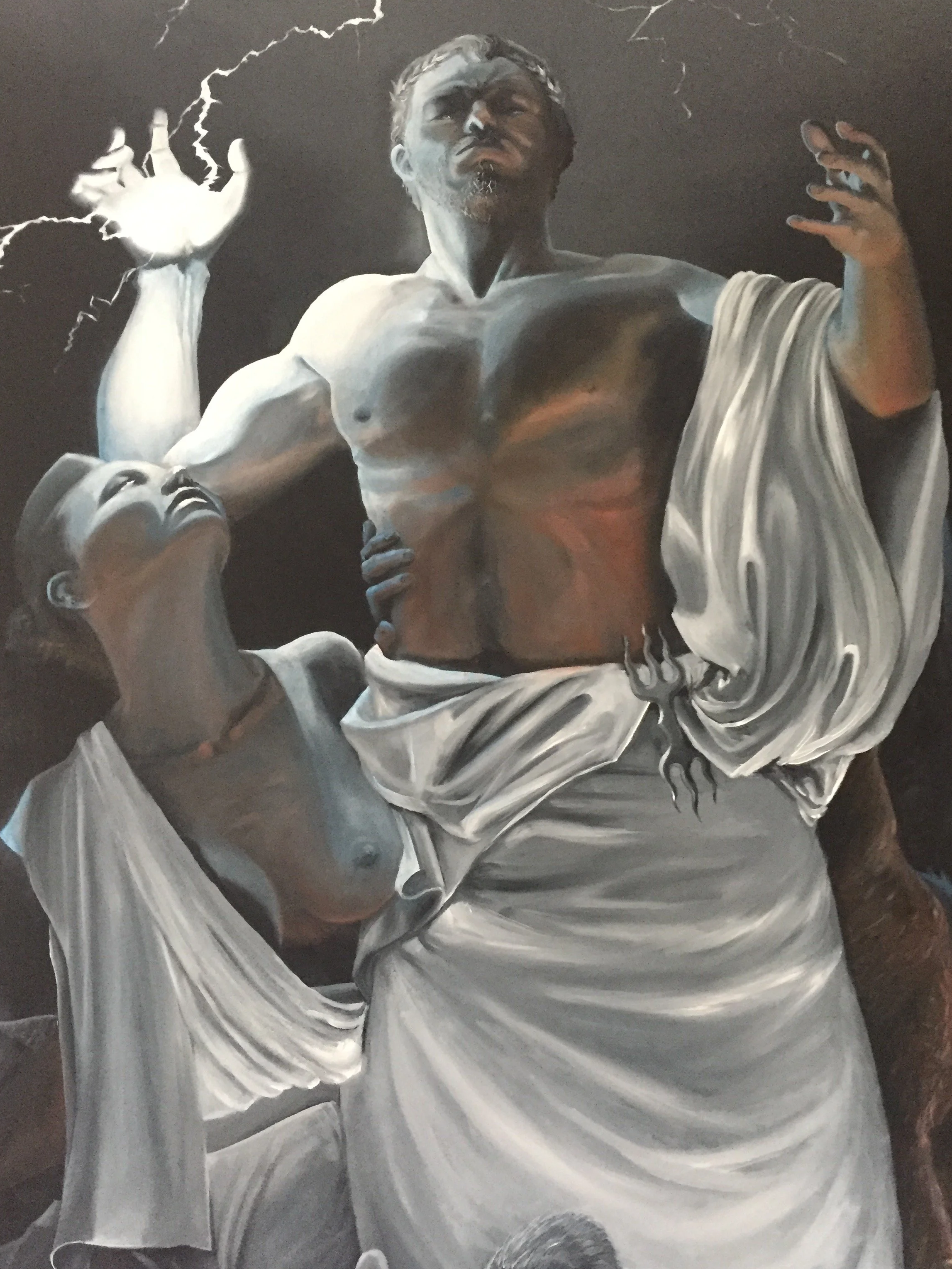
In this work two main light sources are present. The blue light of the lightning at the top of the composition and the orange light of the lightning below. The hue that both light sources cast creates a complementary colour contrast yet this is not the only way in which they create complementary dualities.
The light from the lightning is harsh and creates starkly defined shadows with hard edges. The light from the lava is soft and creates soft transitions of value. Both put together create a complementary contrast is the casting of shadows. This interplay of light also causes the orange glow of the lava to tint the harsh shadows created by the lightning.
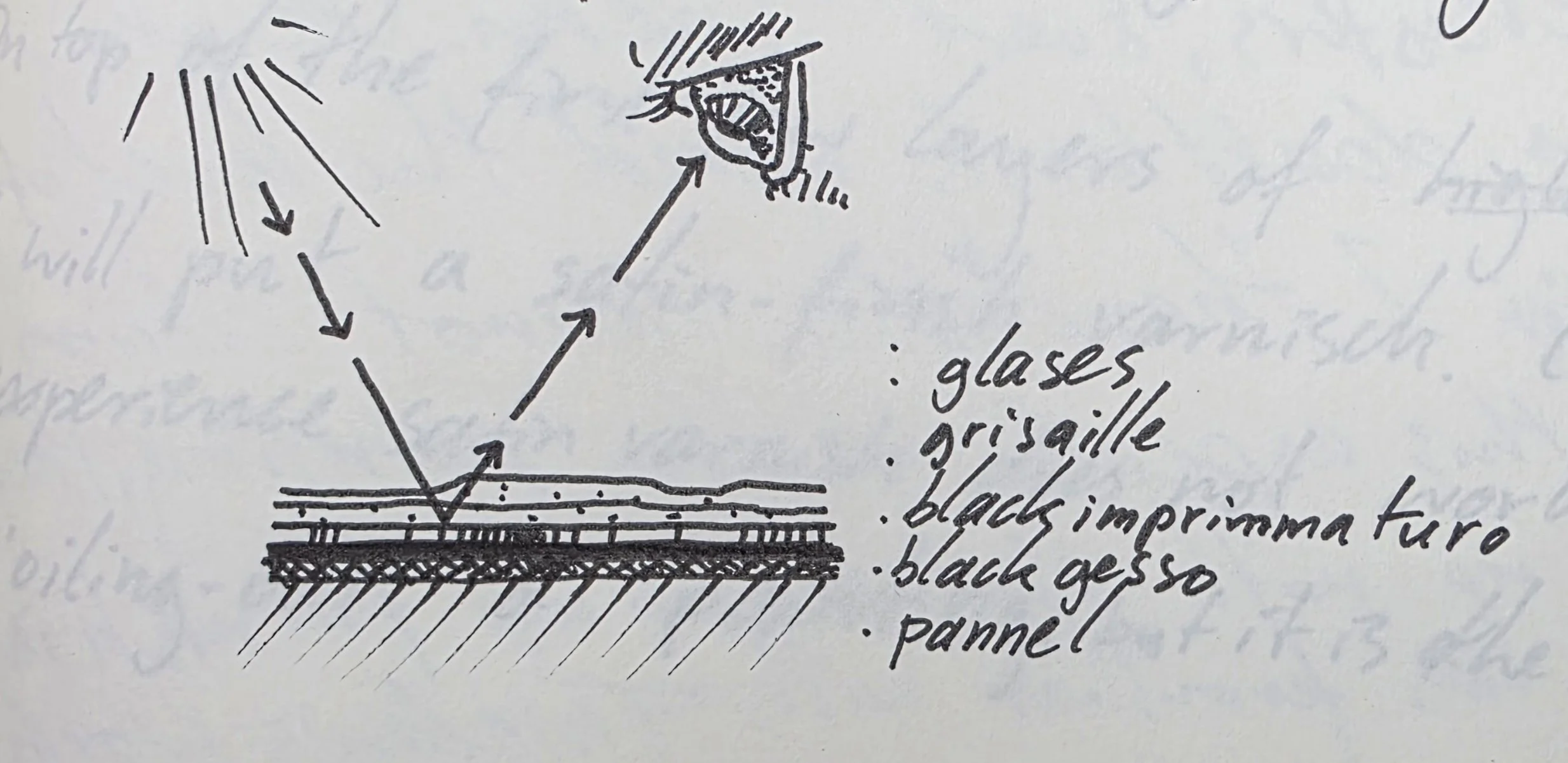
The technique of using a grisaille (not used by Merisi) underpainting with glases of mainly blue and orange on top will (hopefully) result in the painting having a luminous quality to it.
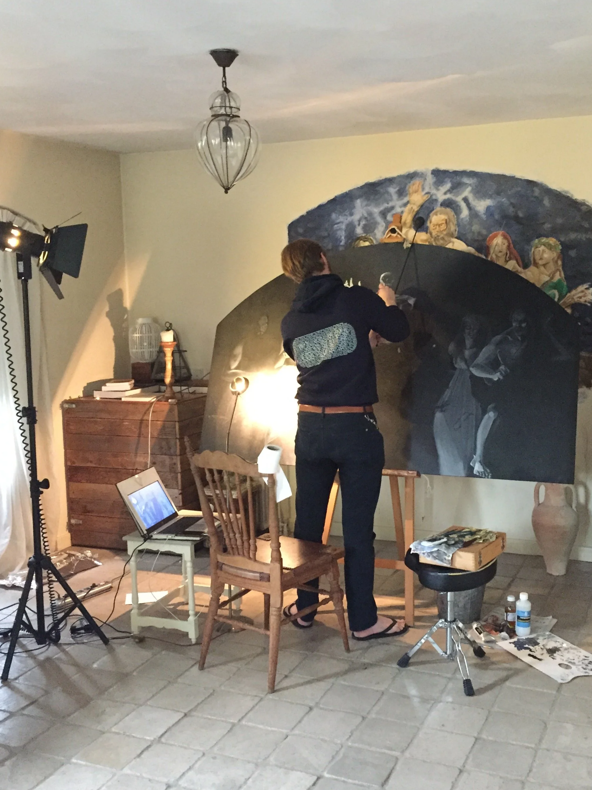
It will hopefully help me, the painter, in achieving the level of detailI require and to first make sure that the characters and shapes have propper three dimensionality and that the value scale across the painting is in order before worrying about the perspective scale in hue.
Now that the grisaille has been completed I can load up my brush with, for instance, transparent blue paint and touch everywhere where the blue light hits, doing the same with orange and all other colours required to, hopefully, make the painting ‘come alive’.
Beyond it beging a sensible approach for me, the painter, using the glazing technique for the cast lights also is crucial for the luminis quality I want the finished painting to have. By using layered glazes, light hitting the painting will have to pass through this transparent glazes, hit the grisaille underneath, pass through the glazes again, before hitting the eyes of the spectator. As can be observed in Old Master paintings using the glazing technique thusly, it can, when applied appropriately, cause the painting to have a luminous quality, almost as if its colours are emitting a glow from beyond the pictures surface. Of course this subtle effect, which can only be observes ‘in situ’ is not caused by a glow, but instead by reflected light passing through the top most layers of the painting.
The use of glazes is not universal good, but it does seem to fit the ‘designio’ of this particular work very well. I therefore plan to use glazes, intentionally and explicitly to achieve a particular effect of the play of light in this painting (one which will not be replicable in photographs).
Pepijn, 2019